We’re on Day 12 of the ESPN BottomLine Watch, and last I checked the BottomLine was still in its old ways. I wonder if anyone has a specific time that the BottomLine reverted to its old ways last Monday the 6th – I’d like to keep a running count.
One reason I didn’t like being cut short on my last post was that I still had one graphical matter yet to be taken care of, and it related to ESPN, which has introduced a new NASCAR banner. I had thought the inspiration was Fox’s NASCAR banner, but now I suspect the real inspiration was an attempt to get a headstart on making the new banner take after MNF.
The main problem I have with it came to me while I was watching the above race live, and it’s the real reason I think this is an attempt to go MNF style: when showing stats like intervals behind the leader, those stats are not shown on a separate line below the scroll, but actually incorporated into the scroll itself, so you might see (for the sake of example) 5. (88) EARNHARDT JR. -1.24, instead of the “-1.24” being on a separate line. “RUNNING ORDER” is also replaced with “INTERVALS” for this purpose, and the leader just lacks an interval, meaning at the start of the scroll the lengths each driver gets vary WIDELY. I prefer at least the appearance of each driver getting the same amount of space on the scroll. But because of the amount of information that needs to be presented, I can see how it might be difficult to properly convert the NASCAR strip for the MNF-inspired hub. Still, here’s a mockup I made; other than being larger than the real thing probably would be, and the rather stunning paucity of driver logos online in any context, and the fact I probably still don’t have the exact fonts, I think it came out well enough I’d be surprised not to see ESPN adopt a variant of this, to the extent I may have gotten myself AND ESPN in legal trouble at some point down the road.
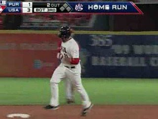
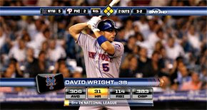
On to baseball, and we start on the national level, with a move with an impact on other sports. In something of a surprise, Fox has adopted the new FSN score bug for baseball broadcasts – a score bug I had thought was intended to match Fox’s own new graphics. In that sense it’s something of a throwback, both to the era when Fox used boxes and not strips, and to those intermittent times when Fox has made a conscious effort to match the FSN graphics. In a more general sense it’s also a throwback to the era when replacing the count AND number of outs with the pitch speed all at once was the norm.
The dissonance between the amount of space taken up by the count and number of outs, and the amount of space taken up by the inning, makes me wonder why the count and number of outs didn’t get a column to itself. But baseball is probably the hardest sport to create a graphic for, especially one originally designed for another sport, unless you have the simplest of strips, because of the sheer amount of information required – in fact I suspect Fox’s move to this was the result of frustration with how last year’s strip turned out. In this case I suspect taking a cue from FSN’s football and hockey (and soccer) bug was called for; I suspect the lack of use of that for basketball and football points to disillusionment with the new horizontal bug. Again, the fonts and sizes are WAY off in this mockup, and I couldn’t quite get the base display to look right.
MLB Network is on the air as well, but I couldn’t find an embeddable highlight. This will have to make do:
The good news is that it adopts a trend I’ve always liked: adding the team logos to the strip. (What I’ve really liked is the logo-only approach once experimented with by Fox on its NFL coverage and now only used by NFL Network, but there’s a reason Fox didn’t stick with it.) The bad news – and it’s not really clear on this thumbnail – is that it’s rather bulky, with large, separated, square elements embedded in a rectangular banner.
What else? We can look at the new graphics for NESN and MASN. So many team-owned RSNs try to get experimental with their graphics and fail. I’m talking to you, SportsTime Ohio. Neither of these two RSNs fell into that trap. MASN only tweaked its graphics and NESN gave them a nice, professional, parallelogram look. (However, I’ve seen evidence that the banner is the only thing NESN changed.)


Do you know any program that can make real-time, live graphics?